01
Attune
Role
Product + Brand Designer
TOols
Figma
Adobe Photoshop
Adobe Illustrator
Adobe Premiere Pro
Adobe Stock
Skills
UX Research
Competitive Analysis
User Journey Mapping
Visual Identity Design
Prototyping
Presenting
Timeline
Mar–May 2026
Advised by
Aggie Toppins
overview
Translating sound into intuitive autonomous navigation
Attune is a hypothetical brand identity and mobile app that helps people choose environments based on sound, not just popularity or location. By translating real-time audio into intuitive visual cues, the system empowers users to find spaces that better match their headspace while demonstrating how a cohesive identity can scale across digital and physical touchpoints.
Challenge
How can sound become something people can navigate?
Instead of recommending places based on ratings or crowd size, Attune explores how real-time sound can become a navigational tool. The challenge was to create a brand identity that made an invisible environmental quality feel intuitive, trustworthy, and visually expressive across every touchpoint.
process
Understanding the opportunity
Rather than jumping into visuals, I first defined what Attune should represent: its audience, personality, positioning, and purpose. This foundation established the product's role as a sensory wayfinding experience centered around user autonomy rather than destination popularity.
Researching the landscape
I analyzed existing navigation and location platforms to understand how they help users make decisions. While competitors focused on location, reviews, or crowd density, none visualized environmental sound as a primary layer of information—revealing an opportunity for differentiation.

Translating sound into a visual language
I explored how sound could become a cohesive visual system. Gradients, density, layered forms, and motion became recurring themes that translated changing noise levels into something users could quickly interpret.

Mapping the experience
Before designing screens, I mapped the complete experience from onboarding through real-time navigation. This clarified core interactions, defined key moments in the journey, and ensured the interface supported the product's sensory-first concept.

Building the identity system
With the concept established, I iterated on the wordmark and icon to balance clarity with approachability. Rounded forms, softened terminals, and subtle gaps reinforced Attune's connection to sound while creating a flexible identity that could extend across digital products.

final results
Wordmark + icon


Mobile application
Physical application
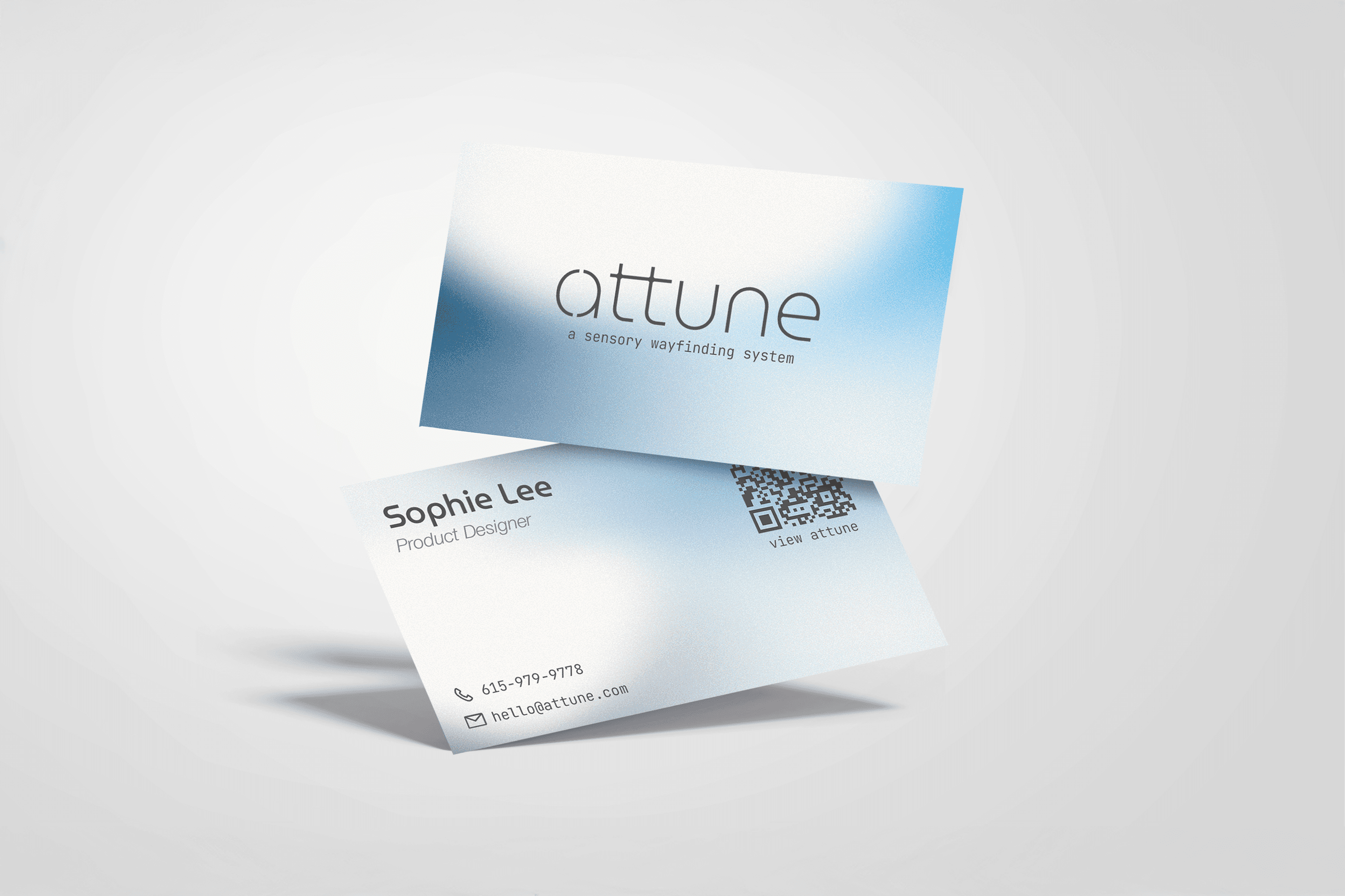
Business card
live audio feedback billboard
The final identity extends consistently across digital and physical applications. Gradients became both a functional visualization of sound within the app and a recognizable brand element across environmental graphics and printed materials, demonstrating how the system adapts beyond a single interface.