06
Cinque Terre

Role
Brand Identity Designer
TOols
Adobe Illustrator
Adobe Photoshop
Pencil & Paper
Skills
Site Research
Visual Research
Typographic Design
Concept Development
Identity System Design
overview
Translating place into a cohesive visual identity
Rather than designing a brand around Cinque Terre's reputation as a picturesque tourist destination, this project explored the cultural systems that have sustained the UNESCO World Heritage Site for centuries. Through historical research and typographic exploration, I developed a wordmark and visual identity that translates Cinque Terre's architecture, landscape, and communal way of life into a contemporary brand system applied across a poster and business cards
Challenge
How can I create a typographic identity that captures Cinque Terre beyond its postcard image?
Cinque Terre is often reduced to its colorful cliffside villages, but its identity is rooted in something deeper. I wanted the brand to communicate the relationship between its landscape, architecture, and the community that has sustained it for centuries.
process
Looking beyond the landscape
I began by researching Cinque Terre's history, culture, and geography to understand what made the site unique beyond its visual appeal. Rather than centering the identity around tourism, I focused on themes of adaptation, community maintenance, and the relationship between the villages and the land that supports them.


Translating research into type

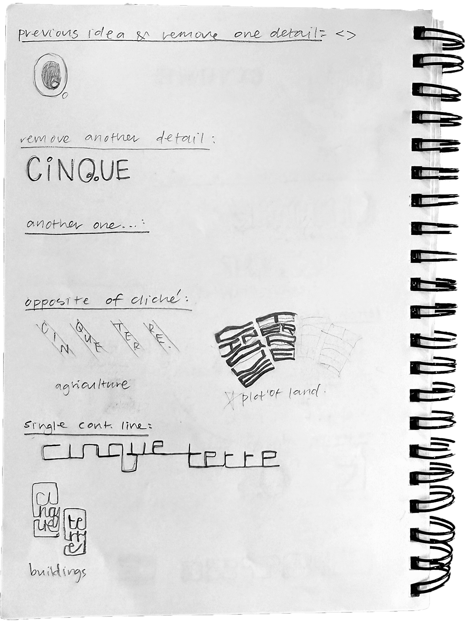


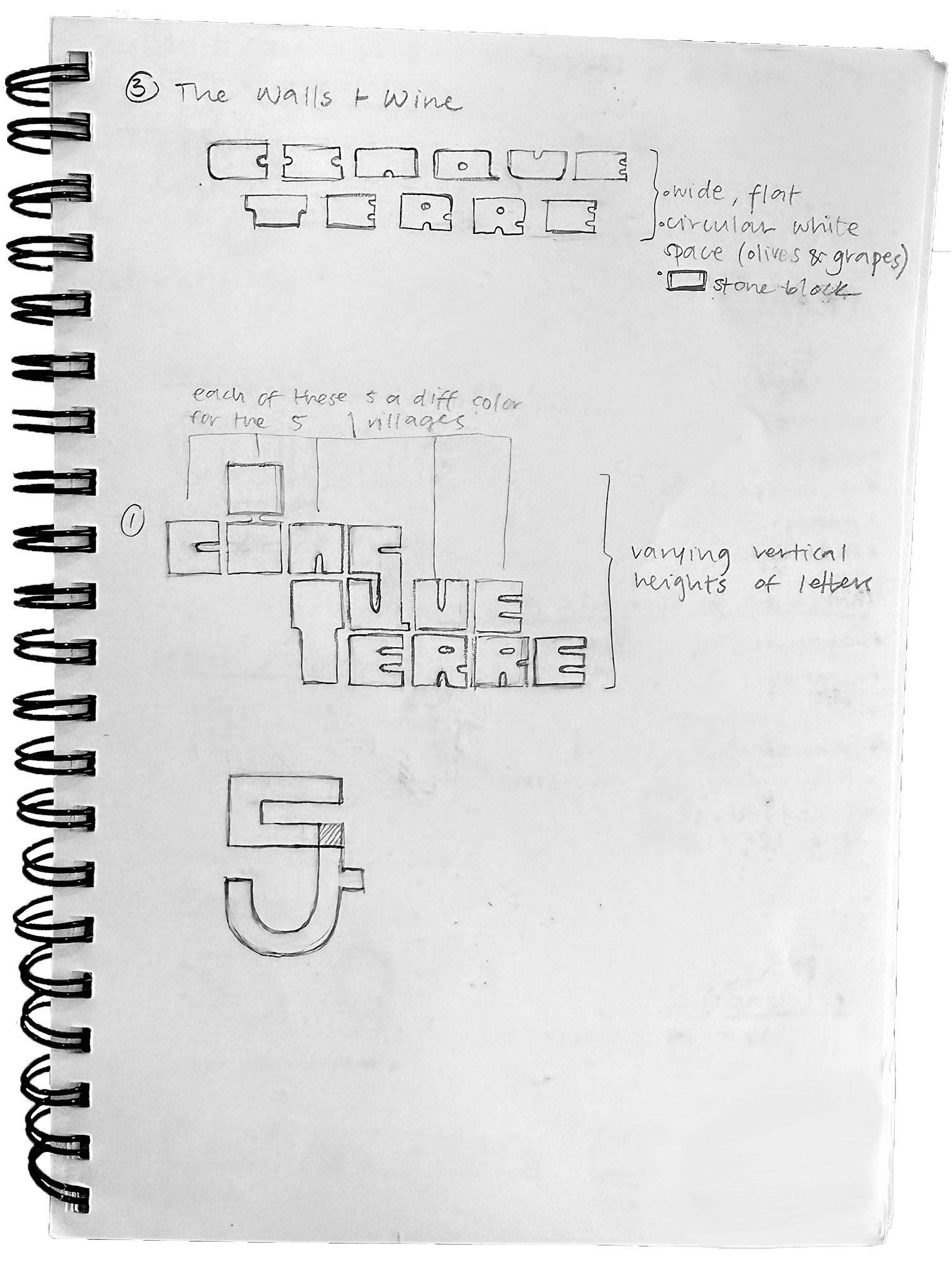
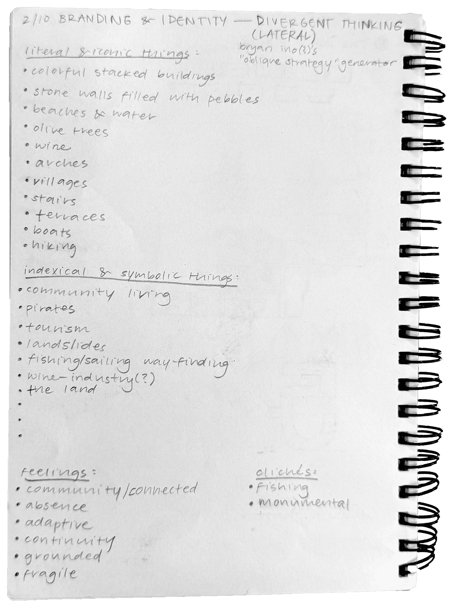
Using these themes as a foundation, I explored how typography alone could communicate Cinque Terre's character. I experimented with stacking, spacing, proportions, and modular forms inspired by the villages' architecture, terraces, stone walls, and dense urban layout.
Exploring three directions
Instead of refining one idea immediately, I developed three distinct concepts that highlighted different aspects of Cinque Terre's identity.

01 Vertical Villages
Focused on the colorful buildings climbing the cliffs through stacked compositions, compressed spacing, and exaggerated vertical proportions.
02 Terraces + Community
Shifted attention toward the agricultural terraces and shared labor that have sustained the five villages for centuries. Overlapping letterforms and a hidden "5" emphasized cooperation and collective identity, though legibility ultimately became its biggest limitation.
03 Stacked Terrain
Combined the strongest ideas from the previous concepts by expressing both the villages' verticality and their dependence on the rugged landscape below. This direction offered the clearest balance between storytelling and readability.
Final results
Refining the wordmark
I refined the final concept by embedding Cinque Terre's physical characteristics into every typographic decision. Tall letterforms reference the villages climbing the cliffs, varying heights recreate the skyline, tight spacing reflects the dense architecture, and rough edges mimic the imperfect dry-stone walls. The rugged divide between Cinque and Terrerepresents the relationship between the built environment and the land beneath it.

Building the identity system
With the wordmark established, I expanded it into a flexible visual system. The logo became neutral to improve versatility, while five accent colors represented the five villages across the applications. Striped backgrounds reference Cinque Terre's beach umbrellas and towels, and the wine festival poster celebrates the region's long history of vineyard cultivation. The business cards further reinforce the system by assigning each village its own color variation and integrating its name into the space between Cinque and Terre.
